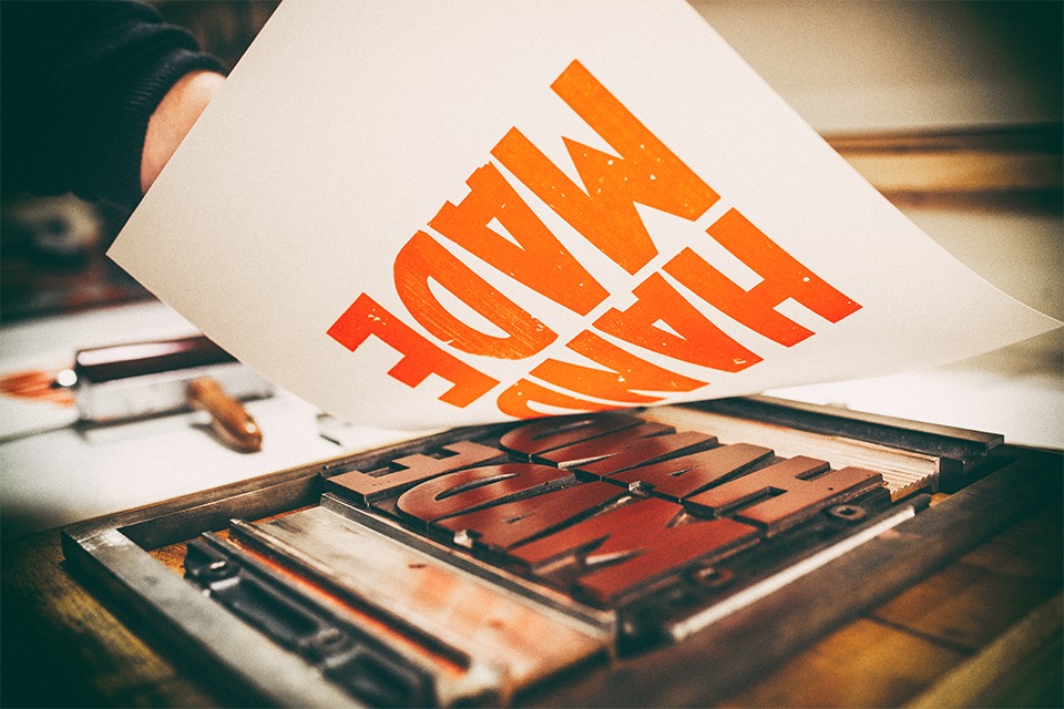
Understanding the Google Rebrand
Today is an interesting day in branding. The officially rolled out logo for the Tokyo 2020 Olympics is rolled back up due to allegations of plagiarism. The evidence is pretty compelling visually, but it’s possible that this was pure coincidence. An unfortunate circumstance, no doubt, but a consequence of being an internationally scrutinized brand.
And then there is the Google rebrand. Rolled out publicly today after what was likely the culmination of months and months of work, and hundreds of design iterations, people will make an instant choice about the new logo. Like or dislike. And that’s it. It will be debated around water coolers by some, hated on by others in design forums and generally judged by the entire world. Most of the comments I’ve heard so far are either positive or indifferent.
And then people will get over it.
Google did what they had to do. They faced many challenges with their (now historic) logo type, and many victories. Rising to fame as the world’s leading search engine, one of the most valuable brands in the world, and one of the most valuable companies in the world is no small feat. And they did it all with a cartoonish playful and hard-to-take-serious logo identity. But they did it anyways. In large part because they were far more focussed on innovation and pushing boundaries and less worried on looking like they were the coolest kid in town. They had the order of branding right; build innovation, hold strong values, develop great culture.
If you read the rationale on the why (which many won’t), it becomes pretty clear on why this was important. They aren’t changing who they are, or what they are, they’re simply adapting visually to meet the needs of their business plan. And that makes sense. When you look under the hood (from a branding perspective), they’ve nailed the entire architecture. They’ve got a crystal clear plan and system in place for communicating across all mediums, on all devices, for all of their products. They’ve removed all of the barriers that were presented by their previous logo, and summed it up into a new system that feels, well… Googly.
The design pundits will hash out the kerning and negative space issues, the missed opportunity to turn things upside down and be disruptive. But the business community should take notice. An intelligently designed brand system for an intelligent company. Disruptive? No. Surprising? Not at all. Logical? Check.