Typography Lesson 2: Basic Principles and Best Practices
In our previous Typography blog, we explored typography – what it is, what purpose it serves in design and how it can impact branding AND the consumers who buy those brands. Now, in this edition, let’s edge a little closer and look at some of the fundamentals of the practice.
It’s important to remember, understanding the basics of typography can be beneficial for everyone, not just designers. We engage with typography everywhere, all the time, and knowing how you are being influenced by these principles helps you develop a critical eye and an aesthetic awareness. Furthermore, when it comes time to create or reconsider your own typographic choices, you will be armed with the information needed to produce the best work possible.
Basic Principles of Typography
In order to know whether or not the typography you are using suits your company, you need to clearly define what your brand is. Who are you? What is your purpose? What are you trying to achieve in the world?
Knowing your brand will help you in all aspects of your visual design, so having this understanding before you decide on typography, or any other aesthetical choices is crucial to accurately articulate who you are to the world.
To understand best practices, we must first look at the basic principles designers use in their day-to-day lives to produce good typography. Let’s break down some of the fundamentals.

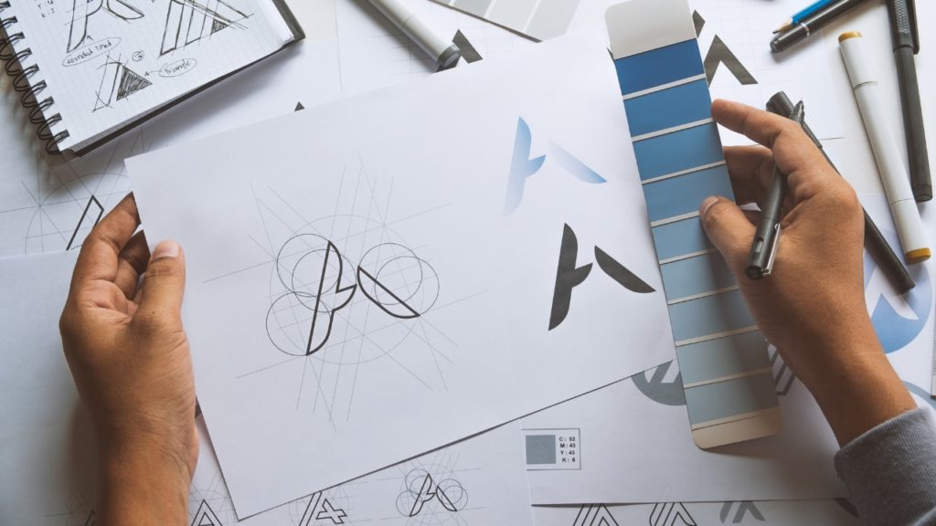
Typography toolkit
As we expand our view, it’s good to get some common definitions under our belt so we know what the heck a designer is talking about. First off, when considering the physical properties of a letter, there are two distinctions we should know when discussing specific details.
One is Typeface, which is the characteristics of the letter form. The second is Font, which is the size and weight of the letters within that style. Knowing the difference between these two terms will help when engaging in typography-related content.
Now that we are looking at terminology, lets also tackle some frequently used terms by designers that can help further explain the principles of the practice.
Terms to know
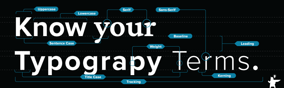
- Baseline – This is the invisible line on which copy or letters rest.
- Uppercase – The capitalized version of letters.
- Lowercase – The small letters of a typeface.
- Title case – A conventional method used for capitalizing words in a title, subtitle, heading, or headline.
- Sentence case – When a heading is written like a sentence, with a capital initial on the first word, followed by lowercase initials for the rest of the heading.
- Tracking – The way to decrease or increase the horizontal spacing between a range of letters or characters.
- Leading – The space between adjacent lines of type.
- Kerning – adjusting the spacing between characters in a proportional font, usually to achieve a certain visual look.
- Weight – the overall thickness of a typeface’s stroke in any given font
- Serif – A small line or stroke attached to the end of a larger stroke in a letter or symbol within a particular font or family.
- Sans-serif – A letterform that does not have serifs at the end strokes.
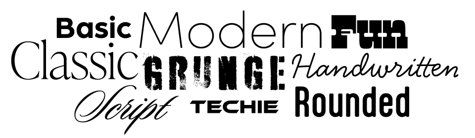
Styles
Naturally, in Typography there are also different schools or styles. Here are some examples of different styles that are standard choices in all types of typography.
Worst (and Best) Practices
Sometimes, in order to understand what good practices are, its best to first know what bad practices are. As a designer, I have come to understand that there are things in typography that you just don’t ever do, and the more I have worked in the field, the more I have understood why.
Like fashion, typography and design has trends, things that come in and out of popularity. Although it can be timely to keep with some of these trends, it is much more useful for the average person to stay away from too much influence and stick to proven methods that work.
More specifically, when it comes to applying typography to print, digital, or any other medium, there are huge red flags to avoid as they will make your designs look sloppy, poorly constructed and out-of-touch.
Here are some things you should never do in typography:
- Squish or distort typefaces
- Add a generic or false bold/italicize in a software type setting like Microsoft Word
- The typeface should already have those variations when you choose it
- Don’t use more than 3 typefaces on a single page.
- By a general rule of thumb, the fonts Comic Sans, Papyrus and Hobo are overused and, frankly, generic. It would be best to just avoid them.
- Limit the number of weight and size of fonts on a single page.
- Best thing to do is to create a typographic style and this can be for print and web. Standardize Headlines, Subhead, Quotes, Body copy, Lists…etc.

Now, here are some important practices you should keep in mind for producing your best (and most impactful) work
- Readability is key for effective typography
- Negative space is your friend
- Futura – This classic typeface looks great when it’s a word or headline but horrible as body copy
- Some fonts are created to use in a smaller look while others are created for bigger. Some might not work when you scale them to a size that it wasn’t intended for.
- Alignment, contrast and consistency are all very important – they build trust
Putting it all in perspective
We’ve covered a lot of basics here but in order to really get a use out of this information, it is important to have a look at the typography you see in the real world and notice these principles at play. When you look at certain logos, certain brands, what do you see?
Can you recognize how the brand is making you feel based on their typographic decisions? You can be sure every new-age brand has a purpose behind their typography, and your perception of the company is shaped by these design choices.
In this lesson, we covered the basics and best practices. Next up, we will put these teachings to practice and look and good and bad typography and, using what we have learned, highlight how you can spot the difference. Stay tuned for more!