Typography 101: What it is and Why it Matters
What is Typography?
Defined as the style, arrangement, or appearance of typeset matter, “Typography is the visual component of the written word,”
A Little History
Typography was born when a caveman first drew an image on a wall and hasn’t stopped evolving since. As long as humans have used writing to communicate with each other, typography has been used to make reading easier, place emphasis, convey meaning, and even create art.
Early advertisements were copy heavy making them dependent on a combination of varying typography and hand-drawn illustrations to get their point across. As the years continued, the number of words on most ads decreased, but to this day, advertisers often still rely on typography to convey their message.
Despite the many advancements made since the printing press, there are still struggles today surrounding modern typography — the main one being technology and accessibility. With many competing software and constant updates, it is hard to make sure that a newly created font can be used, and viewed, from each device. This provides a dynamic challenge, what fonts are usable depends on the software each person is working with.
Typography in Design
Logo identity especially makes use of lettering. With many companies using a wordmark as their logo, typography affects how their brand is perceived. The sizing of the letters, to serif or not to serif, the colours, the spacing and even the style of the characters‑ typography is practical art.
Design and typography are where function meets aesthetics. The craft, planning, and intention behind good typography is a lot like good design—when well executed the viewer won’t notice at all, but when done poorly it’s recognized immediately. Bad typesetting not only makes something difficult to read but can imply poor taste, or worse, incompetency. The purpose of typography is for the ease of the reader above all, but when well made also has the ability to convey a message.
Typography is one of the many multifaceted design decisions that branding and marketing firms must make. From how many fonts to use, to spacing and everything in between, even the most seasoned designer will test out several typefaces before deciding on one.
Anyone who’s been to design school can tell you that not all fonts are created equal and with thousands to choose from today, it’s easy to choose incorrectly. Below we are going to look at three separate examples of typography to discuss what makes them good, bad, or ugly.
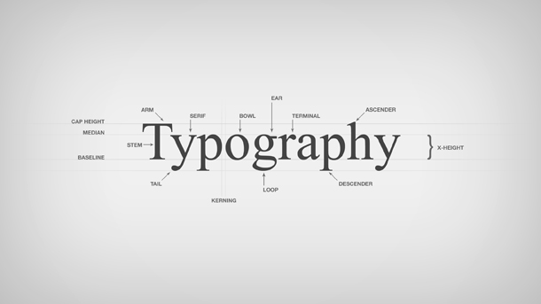
To fully understand what we’re going to critique in each photo, here is a glossary and visual aid on some commonly used typography terms.
Glossary
Leading– determines how text is spaced vertically in lines
Kerning– the spacing between characters in one word (want to test your kerning skills? Click here.)
Font– is the typeface and size of a set of characters
Typeface– the design of a set of characters
Tracking– the spacing throughout the entire sentence
Baseline– the invisible line that text rests on and where descenders (such as the line going down in a lowercase p) go below
Web Safe Fonts– fonts that come pre-installed onto a web program or operating system.
Case Studies
The Good
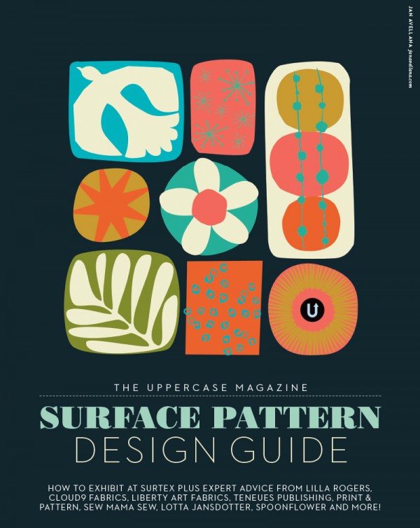
Calgary operated Uppercase Magazine is always a fantastic example for great design and typography. This page has clean spacing, a legible typeface and utilizes font for a style that speaks to the meaning, without disrupting the readability for the viewer.
The Bad
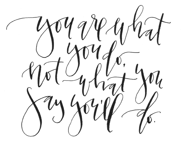
Don’t get us wrong, calligraphy—when executed correctly — can be lovely, but lately, it’s become a three-headed trend monster in the social media world. Difficult to read, with no discernible baseline or spacing, this fanciful writing is plaguing the internet.
The Ugly
The typeface is not consistent, and the rule of thumb with any design is to use no more than 3 fonts. The spacing is entirely off with no baseline or alignment. This sign looks more like a glued together ransom note than a restaurant name.
Key Takeaways
1: Function over everything.
No matter how cool you think something looks if people can’t read it then what was the point of writing it?
2: Design for the medium.
The way something is formatted for a magazine is drastically different from a postcard. Consider where this message will end up and how it will look.
3: Words and sentences need friends.
Widows are sentences that are standalone from the rest of the paragraph, and orphans are words that, for spacing, are standalone in a sentence line. Both are off-putting and to be avoided at all costs.
4: Rules are meant to be broken (if you know them well enough).
None of these rules are set in stone; there are always exceptions. That being said, these rules are there for a reason and it would take a very trained eye to go against these rules and create a function, beautiful design.
Not sure if you’re a typographic hero or zero?
Contact us to receive a complimentary professional critique of your ad or logo.


