Typography Lesson 1: Defining Typography and Its Role in Design
What is typography?
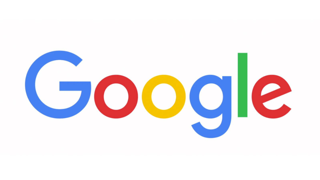
In layman’s terms, typography is the style, appearance and visual arrangement of written or printed words. When you picture a giant company like Google in your mind, what do you see? Most likely, you will recall the playful, coloured lettering that makes the unmistakable Google logo. This is typography at work.
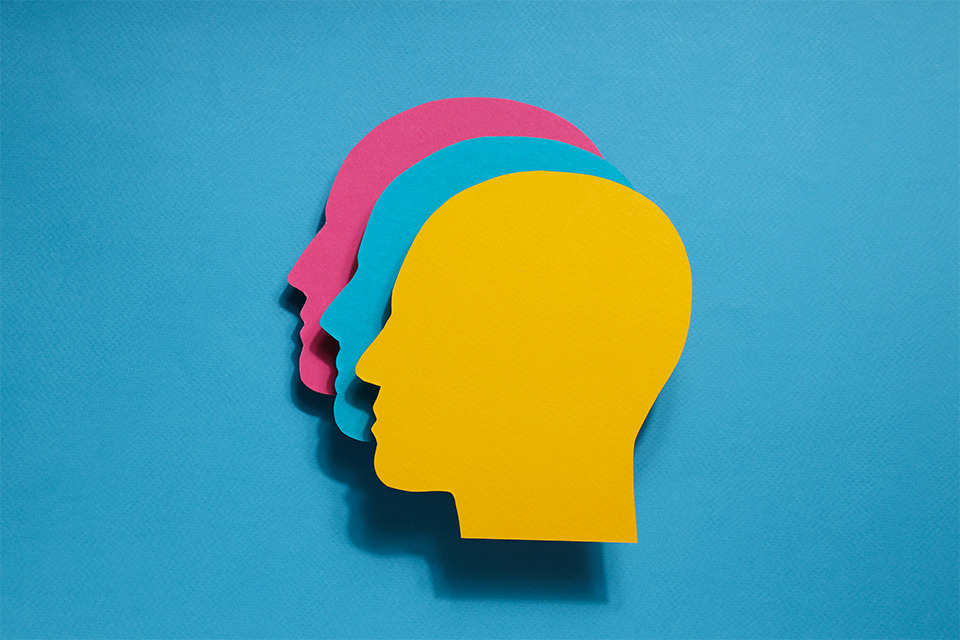
Typography is used to place emphasis, convey meaning, invoke a feeling, create art and even make reading easier. As human beings, we are an inherently visual species. In order to make mundane things like lettering stand out, we add flair and drama to attract the audience’s eye. We do this in brand design, advertising, marketing, communication, visual art and so much more. It is all around us all the time.
In our digitally-driven world, the possibilities for typography have grown exponentially – but, so have the challenges. Constant updates and competing software, make it almost impossible to ensure that a new font can be viewed from all devices. Despite the obstacles, typography exists everywhere and though it might face roadblocks, its importance will never go away.
The purpose of typography in design
When considering logos, it is undeniable that lettering is a substantial component of a brands identity. Since many companies choose a wordmark (a design for a written name) as their logo, typography plays a key role in how a brand is perceived. The letter sizes, the colours, the spacing and even the style of the characters – are all components of typography.
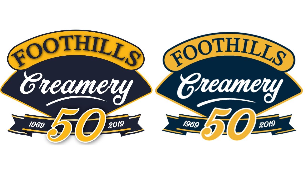
See the slight changes we made to strengthen the typography of this wordmark logo.
The importance of strong typography
Typography can inspire certain feelings or associations that you may not even be aware of. When you picture the Google logo, do you notice the roundness of the G, the slanted E, the slim, green L? Does it almost invoke the feeling and visual image of something fun like, say, a children’s playground? Maybe this occurred to you, maybe it didn’t. The point is, good typography leaves an unmistakable, lasting imprint. On the flip side, bad typography can be catastrophic and turn a customer away from a company, before knowing what the product or service is.
From fonts to spacing, to colouring and much more, seasoned designers will spend hours obsessing over typefaces (the design elements of lettering like width, slope, and size) before deciding on the best one. While brands will spend just as long deciding which one defines them. Anyone who has been to design school will tell you that not all fonts are created equal and with thousands to choose from, it can feel like a minefield.
So, naturally, typography and design go hand in hand. When companies want to cater to a demographic, the typography will be modelled after their audience and used to convey and invoke a feeling – a feeling that will associate the client to the brand. Have a look at some of your favourite brands and consider the design elements used in their wordmark. You might uncover motives that you hadn’t realized were influencing you all along.
Why it matters – now and forever
Now more than ever, image is everything. According to a recent study, the average Canadian spends 49 hours and 43 minutes online per week. In Brazil, people spend over 90 hours per week online. That means every day we stare at screens that show us designs, images, videos – anything to catch our attention. All while working to commit an action such as liking, sharing, or making a purchase.
Additionally, off our screens, we are inundated with signs, billboards, brochures, magazines, educational materials, books and ads. On and on the content wheel spins – showing us just how important it is to stand out, articulate your point (or brand), and inspire a feeling that resonates.
Typography is a way to do that. Through design and an understanding of who your company is, what you do, and who you want to appeal to, you can create typography that will sell your identity. In this blog, we have just scratched the surface of the function of typography in the real world. In the next one, we will look at the basic principles, the best practices, and examples of good/ bad typography.
Stay tuned for our next blog in this series and consider what the copy in your surroundings might be saying to you!